 Is your process in control? The XmR chart is a great statistical process control (SPC) tool that can help you answer this question, reduce waste, and increase productivity. We'll cover the concepts behind XmR charting and explain the XmR control constant with some super simple R code. Lastly, we'll cover how to make the XmR plot by hand, with base R code, and the ggQC package.
- Grasp the XmR chart concept and utility
- Understand the math necessary to create the XmR chart by hand, and why moving range should be used instead of standard deviation to determine control limits.
- Be able to create an XmR chart from scratch
- Be comfortable using a piece of software to help you make one.
Why an XmR Chart
Think about something you do for yourself regularly. Do you do it in a very particular way? And, when you do it just that way is the result amazzzzing? Maybe it's how you brew that pot of coffee in the morning, how you style your hair, or how you spice your favorite dish. Whatever it is, you have a desired outcome and you know just how to make it happen – time and time again. You have a process, a method of making or doing something with a repeatable outcome.
Now, suppose you decide to start a business sharing that special outcome with the world. You'll need to train others to execute your process. But, how will you know your workers are successful? You'll need feedback from your process, a measurable to make sure your process yields the desired outcome. By monitoring this outcome, you'll know your process is in control. This is what an XmR control chart allows us to do.
XmR Core Concepts
To illustrate how an XmR chart helps us understand our process, let's use a simple example. For the moment, pretend you own and operate the world famous ACME Hammer and Nail Company. Your claim to fame is making the world's finest nails, and right now you are starting a new process for 0.75 inch nails. To monitor the process over time, you measure nail length (the process measure) to insure the mean nail length (the process center) produced is indeed 0.75 inches plus or minus some natural wiggle in the data (the process variation). Using an XmR chart, as shown below, you can bring all these process terms together. The XmR chart becomes the voice of your process.
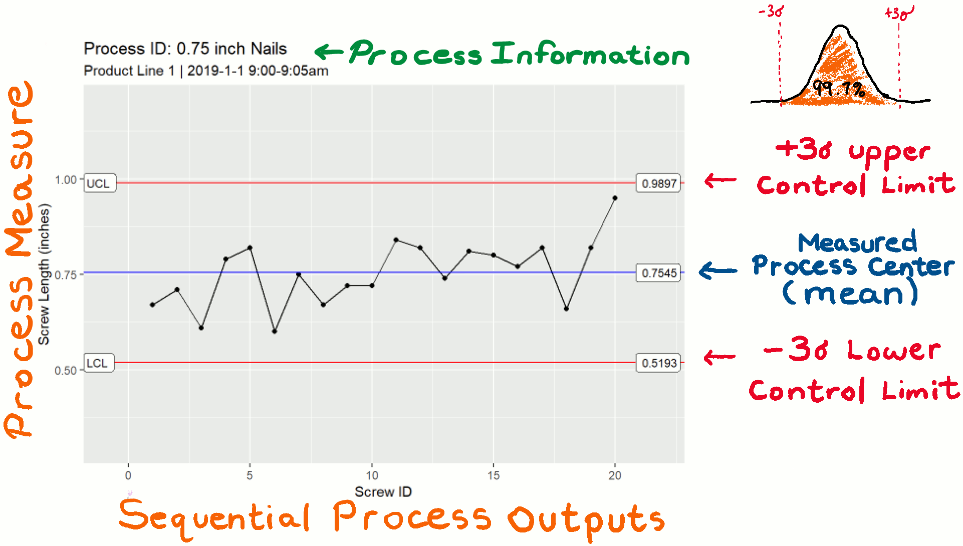
Starting with the graph title, we see that this XmR chart is about the 0.75 inch nail process and that the data was collected form product line 1 between 9:00am – 9:05am. During that 5 minute period, 20 nails were produced and each nail was given a sequential ID. The order that data appears in the plot, must be sequential. Thus, the sequential ID given to each nail defines the x-axis. The y-axis is the actual measured nail length (the process measure) in inches. We see that the data is centered around the blue center line in the graph, (the process center). The chart also shows that the data is bouncing randomly around the blue center line due to inherent process variation. Finally, we see two red lines labeled lower control limit (LCL) and upper control limit (UCL). If your process is in statistical control, ~99% of the nails produced will measure within these control limits.
So, the bare minimum you need to make an XmR chart is:
- a process (that ideally isn’t changing)
- a sequential output from the process (products)
- a relevant measurement or key performance indicator for your process that tracks an important quality.
- and some math to put the chart together
Let's dig into the math.
XmR Control Limits
In the XmR chart, the center line represents the mean of your data. Nothing special here, just the mean of your data. But, there is also the red lines. These define the upper and lower control limits. To determine these, you need to determine your random process variation. In the XmR context, taking the standard deviation of your data does not necessary yield the random process variation. There is a better way.
So how do you determine the random process variation and control limits?
Good question. To answer it, we need a second piece of information from our process data – the mean moving range (mR). Notice that the abbreviation “mR” is part of the XmR chart title. The X stands for the individual data points and the mR is how we determine the variability. From this variability metric, we determine the process's lower and upper control limits.
Mean Moving Range and Control Limits
There are 3 steps to determining XmR Control Limits
- Determine the mean(mR)
- Convert the mean(mR) to a sequential deviation
- Use the sequential deviation to calculate the control limits.
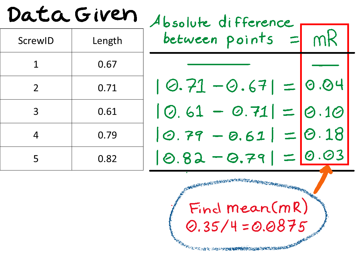
The first step is to determine your process's mean moving range, mean(mR). To determining the mean(mR), find the absolute difference between sequential pairwise measurements. Then take the mean of ranges you've calculated. The calculation of mean(mR) is demonstrated below on five data points.
For the second step, we need to convert the mean(mR) to a sequential deviation. If you're just looking for a quick answer: divide the mean(mR) by the control constant 1.128 to calculate the sequential deviation and move on to the calculating XmR control limits section. If you need more than divide and trust me, read on. Whatever you do, Resist the temptation to just use the standard deviation of your data points to determine your control limits. “Why?”, you ask. Because, the moving range is sequence sensitive and demphasizes systematic variation, allowing us to more clearly measure the inherent random process variation. The standard deviation is a measure of total variation (ie., systematic variation & random variation). To see more on this important but slightly advanced topic check out my article: XmR Control Limits | Why Moving Range, not Standard Deviation.
The XmR Control Constant – 1.128
If you're like me, you get a little uncomfortable when someone tells you, “just divide these numbers and trust me.” That said, you probably want to know more about that 1.128 number I used to convert the mean(mR) to a sequential deviation in the previous section. To explain the 1.128, we are going to do a little math and a super simple simulation in R. When we're are done, we'll return to the task of calculating the XmR control limits. Let's get started.
Simulation Setup
Our goal is to develop a sequence sensitive deviation based on the mean(mR) of our data. I call it sequential deviation. Determining this value will allow us to better quantify the random variation in our process and minimize systematic effects. We start with the relationship that the mean(mR) is proportional to the standard deviation of individual data points sampled from a standard normal distribution with mean = 0 and standard deviation = 1 (no systematic variation, all random variation). Next, we state that so long as the data are distributed normally the Standard Deviation is equal to the Sequential Deviation. This is because all variation is random; none is systematic. The relationships are expressed in Equations 1 and 1.1 below.

From here, we simplify things by substituting the standard deviation with sequential deviation in equation 1. We also get rid of the proportionality symbol by inserting a proportionality constant, d, between the mean(mR) and the sequential deviation of individual samples. The new expression is shown in equation 2:

Simulation
Now, we just need to determine the constant, d. To do this we are going to run a very simple R simulation. The simulation will do the following:
- Draw 10 million samples from the standard normal distribution (mean=0, sd=1),
- Determine the absolute difference between every consecutive pair of data points, yielding a series of ranges
- Take the average of all the ranges, yielding the mean(mR)
- From EQ 1.1, we know the sequential deviation = standard deviation = 1 under these conditions.
- thus from Equation 2, the mean(mR) determined in step 3 is the value of d (the constant we are looking for…)
OK here is a very simple R code to run our simulation.
1 2 3 4 5 6 7 8 9 10 11 | require(dplyr) # to get the easy to read pipe operator %>% set.seed(5555) # So you can reproduce my sampling of the normal distribution rnorm(n=1e7, mean=0, sd=1) %>% # 10 million samples form normal distribution diff() %>% # Difference between each point abs() %>% # Absolute value of each difference (moving range...) mean(na.rm=T) -> # The mean of the moving ranges d # assigning to the constant d d # printing d to screen #>> [1] 1.128346 |
Result
So from our simulation, we have determined that:

OK, I told you d would be 1.128 earlier, but now you know why. If you have some previous experience with making control charts or have looked at a table of control chart constants recently, the number 1.128 may be familiar. It is the value for d2 when n = 2. If you've never heard of control chart constants before. Don't worry, 1.128 is all you need for XmR. Other constants, become more import when you're working with XbarR or XbarS charts. For now though, we are going to keep our focus on XmR.
Calculating XmR Control Limits
Using our new found knowledge of d and rearranging equation 2, we can easily determine our sequential deviation from the mean(mR) as shown in equation 3.

Using this relationship, if we have a nail production process that yields a mean(mR) of 0.125 inches, equation 3 tells us we have a sequential deviation of 0.111 inches.
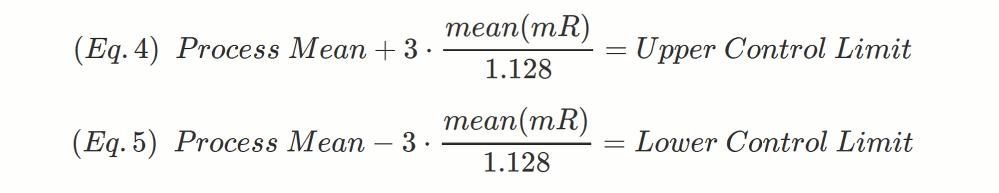
Great, we understand where the 1.128 came from. Now, we need to use it to calculate the XmR control limits. To determine our upper and lower control limits in the XmR chart, we want to use ± 3 sequential deviations around our process mean. Why ± 3 sequential deviations? Because, if our process is in statistical control, ~99.7 of our product will measure within the control limits.
Here are the expressions for the upper and lower control limits in terms of mean(mR):
continuing with our 0.75 inch nail scenario, if our mean(mR) is 0.125 inches then
- The process mean should be 0.75" (hopefully).
- The upper control limit will be 0.75 + 3 * (0.125/1.128)
- the lower control limit will be 0.75 – 3 * (0.125/1.128)
Recap
Awesome. here's what we've covered:
- The parts of an XmR plot,
- How to determine moving range.
- How to convert moving range to a sequential deviation.
- Why you should use sequential deviation and not standard deviation.
- How to determine the control limits from the process mean and the sequential deviation.
Let's use what you've learned in an example.
Step Wise XmR Example
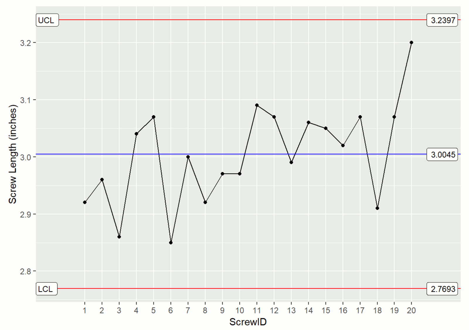
Make an XmR chart for the following data involving 3 inch screw lengths.
| ScrewID | 1 | 2 | 3 | 4 | 5 | 6 | 7 | 8 | 9 | 10 | 11 | 12 | 13 | 14 | 15 | 16 | 17 | 18 | 19 | 20 |
| Length | 2.92 | 2.96 | 2.86 | 3.04 | 3.07 | 2.85 | 3.00 | 2.92 | 2.97 | 2.97 | 3.09 | 3.07 | 2.99 | 3.06 | 3.05 | 3.02 | 3.07 | 2.91 | 3.07 | 3.20 |
| mR | NA | 0.04 | 0.10 | 0.18 | 0.03 | 0.22 | 0.15 | 0.08 | 0.05 | 0.00 | 0.12 | 0.02 | 0.08 | 0.07 | 0.01 | 0.03 | 0.05 | 0.16 | 0.16 | 0.13 |
- Determine the mean, which is: 3.0045
- Determine the mean moving range, which is: 0.0884211
- Calculate the sequential deviation, which is: 0.0884211 / 1.128 = 0.0783875
- Calculate the upper and lower control limits which are:
- Lower Control Limit = 3.0045 – 3 * 0.0783875 = 2.7693376
- Upper Control Limit = 3.0045 + 3 * 0.0783875 = 3.2396624
- Create the Plot
Do it Yourself XmR
Below is some temperature data in Fahrenheit taken from a coffee brewing setup.
| CupID | 1 | 2 | 3 | 4 | 5 | 6 | 7 | 8 | 9 | 10 | 11 | 12 | 13 | 14 | 15 | 16 | 17 | 18 | 19 | 20 |
| Temp | 198 | 199 | 196 | 201 | 202 | 196 | 200 | 198 | 199 | 199 | 202 | 202 | 200 | 201 | 201 | 200 | 202 | 198 | 202 | 205 |
| mR | NA | 1 | 3 | 5 | 1 | 6 | 4 | 2 | 1 | 0 | 3 | 0 | 2 | 1 | 0 | 1 | 2 | 4 | 4 | 3 |
Calculate the following quantities: (To check your answers, mouse-over the word “answer” or click)
- mean – Answer
- mean moving range – Answer
- the sequential deviation – Answer
- the upper and lower control limits – Answer
- Make a plot in your favorite plotting software
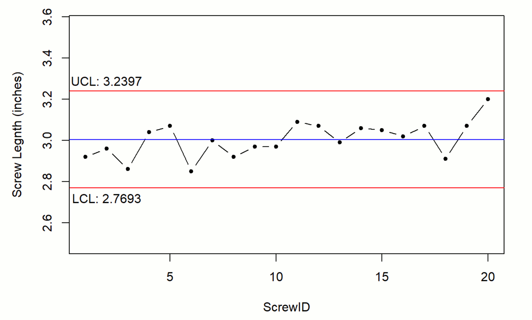
Code to Make an XmR Plot in Base R
For those who like to see all the work of specifying the lines and plot details, here is an example in R's base plotting system.
1 2 3 4 5 6 7 8 9 10 11 12 13 14 15 16 17 18 19 20 21 22 23 | #This code was used to generate the example data in the example above... set.seed(5555) example.data <- data.frame( ScrewID = as.factor(1:20), Length = round(rnorm(n = 20, mean = 3, sd = 0.1),2) ) #Caluate the mean and limits the_Mean <- mean(example.data$Length) the_mR <- mean(abs(diff(example.data$Length))) the_Sigma <- the_mR/1.128 the_LCL <- the_Mean - 3 * the_Sigma the_UCL <- the_Mean + 3 * the_Sigma #Make with Base Plotting System plot(x = 1:20, y = example.data$Length, #give plot the x,y data type="b", pch=20, # specify point and line chart with solid points ylim=c(the_LCL*.9,the_UCL*1.1), # Set the chart's y-limits slightly larger than control limits xlab="ScrewID", ylab="Screw Length (inches)" # Label the axis ) abline(h = c(the_LCL,the_Mean,the_UCL), col=c("red", "blue", "red")) #Draw The Lines text(2, the_UCL+.05, labels = paste0("UCL: ", round(the_UCL,4))) #Draw the line labels text(2, the_LCL-.05, labels = paste0("LCL: ", round(the_LCL,4))) #Draw the line labels |
Make an XmR Plot with R’s ggQC Package
Typically our job is to make decisions based on an XmR plot and not to get hung up on creating them. ggQC is one of several quality control packages in R that make creating XmR charts simpler.
Below is quick example of building an XmR chart with ggQC. Notice that all the calculations are done for you.
1 2 3 4 5 6 7 8 9 10 11 12 13 14 15 16 17 | #This code was used to generate the example data in the nail example above... set.seed(5555) example.data <- data.frame(ScrewID = as.factor(1:20), Length = round(rnorm(n = 20, mean = 3, sd = 0.1),2) ) #Load the Necessary Packages require(ggQC) require(ggplot2) #Make the Plot ggplot(example.data, aes(x=ScrewID, y=Length, group=1)) + geom_point() + geom_line() + stat_QC(method="XmR", auto.label = T, label.digits = 4) + ylab("Screw Length (inches)") + scale_x_discrete(expand = expand_scale(mult = .15)) |
Visit rcontrolcharts.com to learn more about ggQC and its capabilities.
Summary
XmR charts are one of the simplest control charts to prepare, but you need to know a thing or two about them before implementing. The key inputs for an XmR chart are a process, a detail you want to control, and a measurable on that detail you can track sequentially. Once you have these pieces, you can apply everything you've learned here regarding the XmR chart and the math need to make one. Before we end, some food for thought on the term “process”. A Process is a way of making or doing a set of actions that yield a desired outcome. With this definition, a process could be making nails or it could be measuring nail lengths. The XmR chart can provide information about the act of making as well as the act of measuring. Happy charting.

7 Comments
Pingback:
Pingback:
Pingback:
Pingback:
Pingback:
Pingback:
Pingback: