 As an experienced R user, I have seen numerous social media posts and perhaps even a few stackexchange requests over the years asking the question, “how do I learn R?”. This is a great question. A related one is, “how do I teach or coach R?” To the would-be student, I ask, “What attracted you to R in the first place?” I suspect it wasn't that it was free, though this is a reasonable motivation considering the cost of comparable commercial software. To the newcomer, were you attracted to R because of a graph you saw on the web, in a lecture, presentation or article? Teachers, what drew you to R, was it the cryptic coding style “<-”, the sexy statistical analysis, or something else? For me as the student and the practitioner, R is an absolutely amazing communications tool. You've got Shiny, you've got markdown, and you've got models. And at the core of these communication features is the plot. And so, if you are learning or teaching R, I say to you, “Get to the plot!”
Overview:
Learning R – Make it Useful Quickly
R has some amazingly eye-catching plotting capabilities. Perhaps one of these caught your attention. You may have asked how it was made, and someone casually said, “I made it with R. It's free. Check it out.” Motivated by “free” and awesomeness, you install R and find out there was a lot left unsaid in the phrases “I made it with R. It's free. Check it out.” How exactly are you supposed to use the cryptic R console to generate that cool plot?
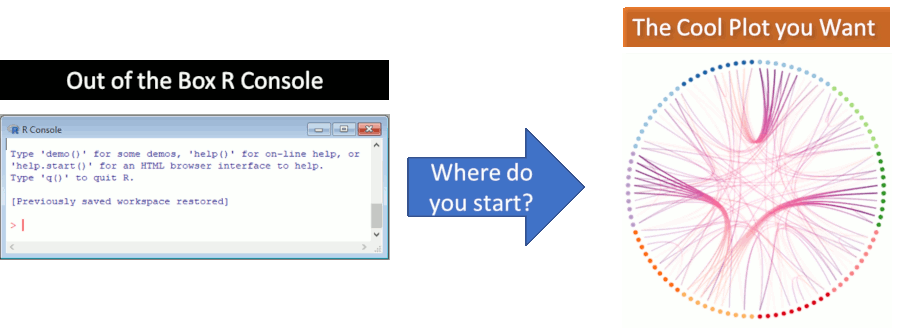
As you start to dig in, you might be daunted by stuff about vectors, matrices, and data manipulation. My recommendation to you though is put your blinders on and get straight to the plot. By this, I mean keep it simple and find the quickest way to plot your own data. Don't get hung up on vectors, matrices, and data manipulation. They will come out of necessity. When you are ready, books, stackexchange and tone of blogs are out there to help you on your journey. For now, stay focused and “get to the plot”. Show yourself how simple it can be.
New R Users: 8 Steps to Make a Basic R Plot
- Breathe – you really can make awesome plots with R, and it’s easy. You just need to start somewhere.
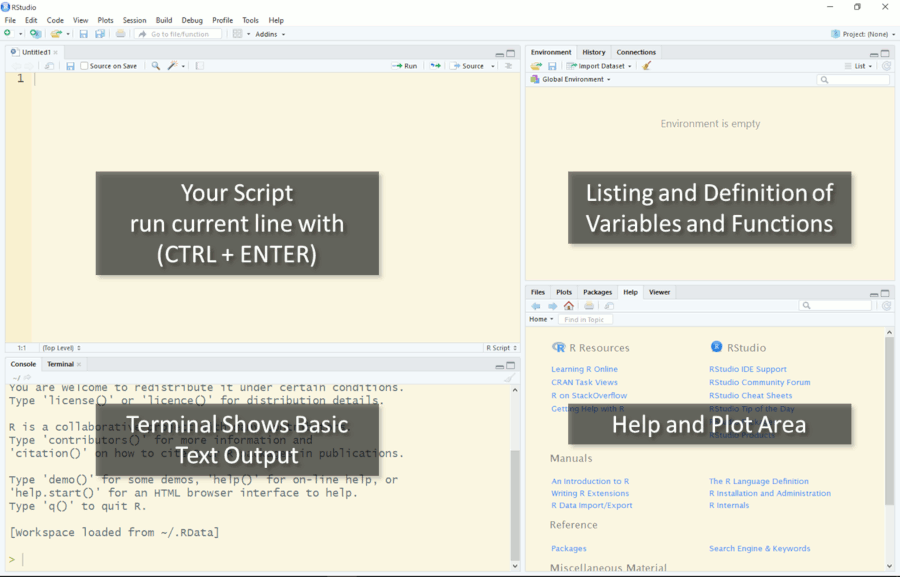
- Install R Studio – The out-of-the box R interface is difficult to say the least. Just close it and go download, install and open R-Studio. Don’t worry about all the screens just yet. For now, go to file -> new script. The R-Studio interface should look similar to the screenshot below.
- Next, open your favorite spreadsheet software, and then Open a simple example of YOUR data you would like to plot. Again, keep it simple, 2 or 3 columns…. I’ll be using the data below to demonstrate:
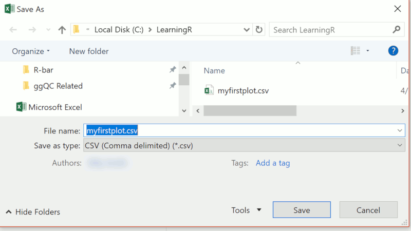
CupsOfCoffee TripsToTheBathroom WorkProductivity 1 0 50 2 1 80 4 5 95 7 8 50 9 10 20 - Save your data as a CSV file in Excel using Excel’s save dialogue screen shown below. Save to someplace simple like “c:/learningR/myfirstplot.csv” .
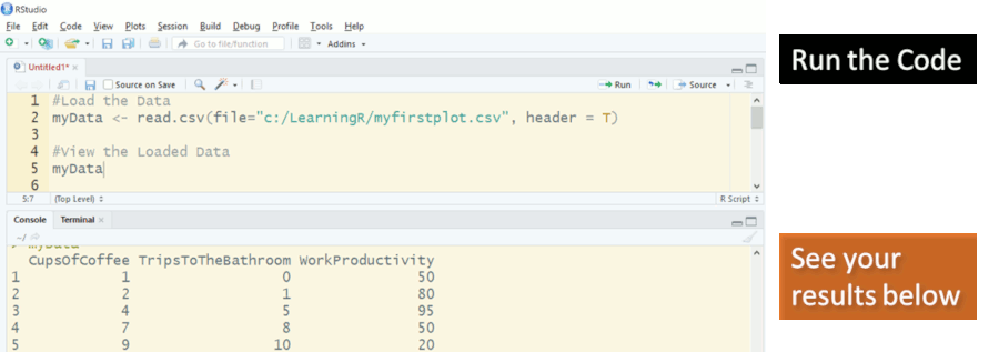
- Flip back to R-Studio and load the data into a container called “myData” with the following command.
1
2
#press (CTRL + ENTER) to run the line
myData <- read.csv(file="c:/learningR/myfirstplot.csv",  header = TRUE)
There are different types of “containers” in R, this one is technically called a data frame.
Note: the container’s name could just have easily been “Bobs_Data” or “CatEatsDog” but not “2CatsEat1Dog”. Container names can’t start with numbers.
- See if the data is in the “myData” container? Check by typing myData on a line by itself and pressing (CTRL + Enter). The result should show up in the console window below, looking something like:
Almost there 2 more steps.
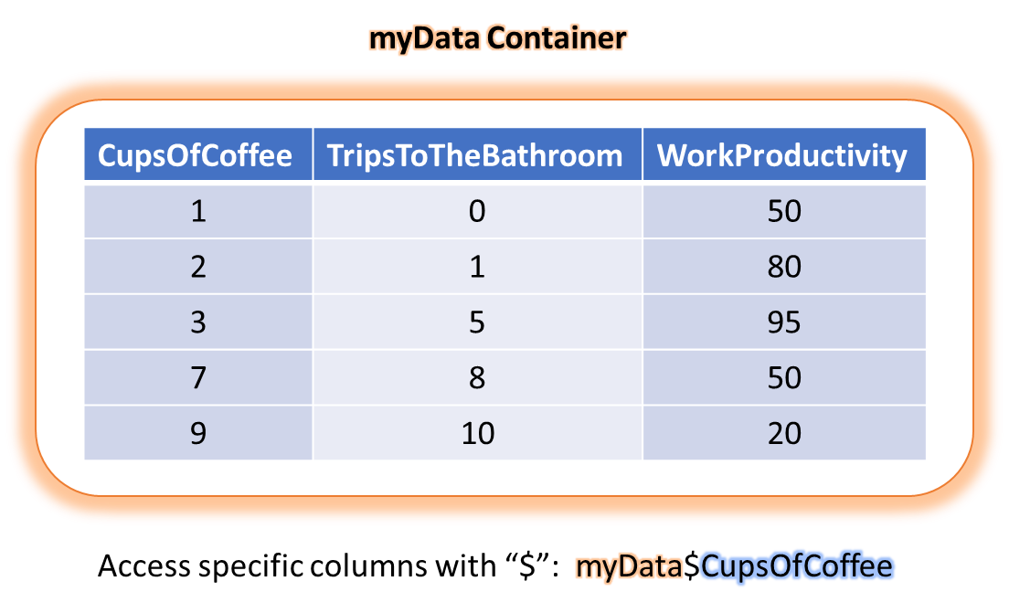
- You’ll need to have access to your data columns inside the myData container. For this, we use the $. To get a specific column, say CupsOfCoffee, in the myData container we would write this: myData$CupsOfCoffee. Here is a visual:
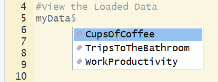
In R-Studio, the column names should appear after you type the “$”, as shown below.
- Plot with the plot() command like this:
1
plot( x = myData$CupsOfCoffee, y = myData$TripsToTheBathroom)
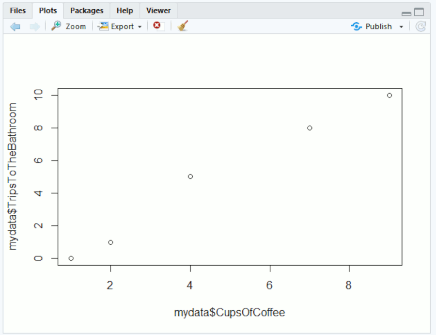
Congrats! You made your first plot. It’s not pretty, I know. But you need to start somewhere.
Challenge Yourself
Using the internet (Do the research! stackexchange is very helpful for simple questions like those below)… figure out how to:
- Add a title to your plot
- Adjust the x and y axis labels
- Make the points bigger
- Change the point style & color
- Change the plot view limits along the “x” and “y” axis
- Make a line plot or a line + point plot
In the console window, write ?plot and press enter. Help for the plotting topic will show up in the right window tab labeled help. How many of your challenges above could have been answered by looking at this help document?
Next Steps for New Students of R
Awesome you just made a plot. Yes, I know you could have made this in your spreadsheet software in a few heart beats. But how long would it take you to make a more complex visualization with multiple plots that share a common axis? For example, what if you wanted to look at the relationship between all of your columns using a matrix plot:
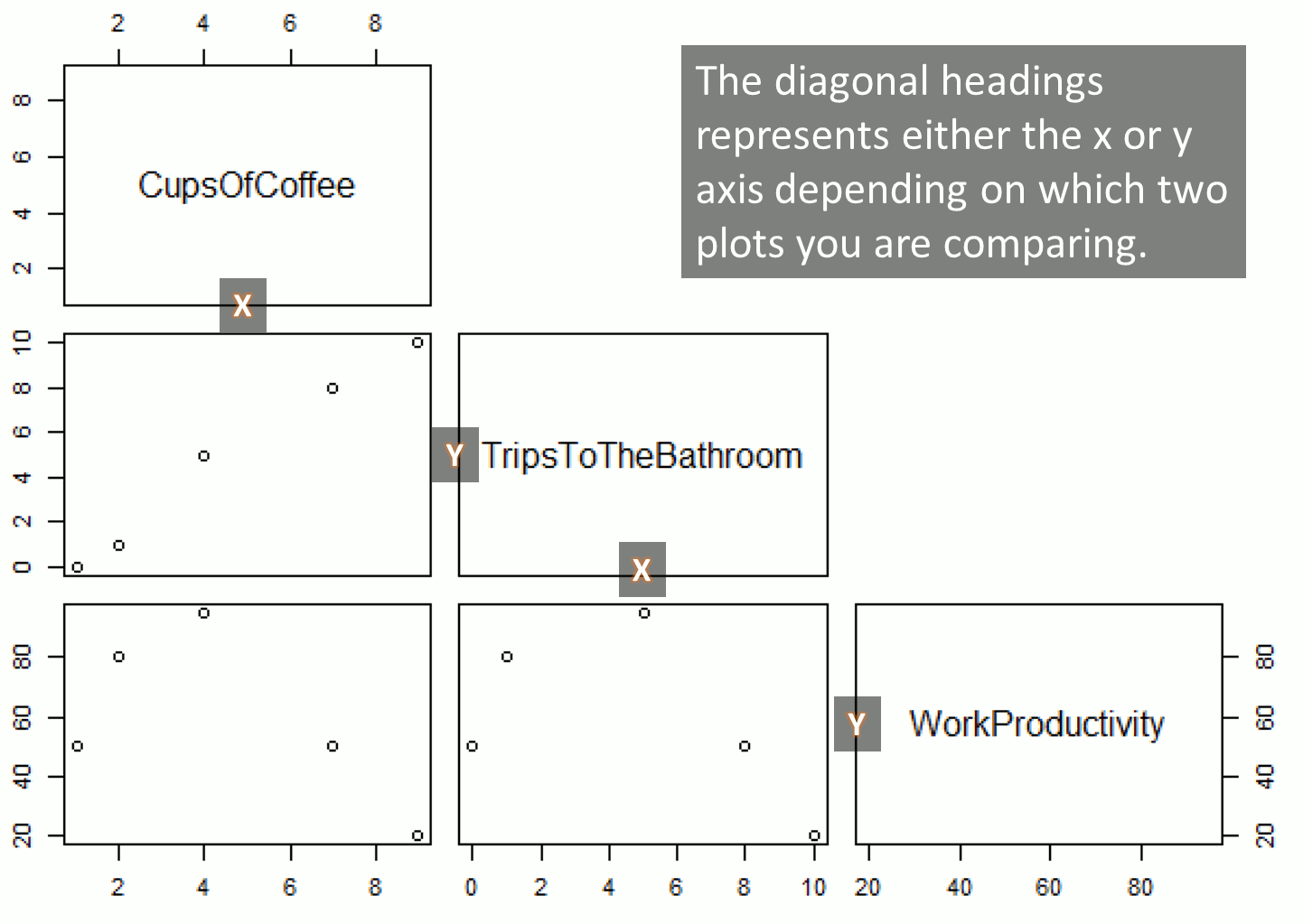
R can do this in a single command:
1 | pairs(myData) |
Student Recap
You've learned the bare minimum to plot, and you've also learned about a data frame container. You'll want to learn more about data frames, later. Other suggestions to speed you along in your journey:
- Practice loading and a plotting a few other simple datasets as outlined above. (get comfortable doing this). What happens when you have spaces in column titles?
- Learn how to load packages. Load the “ggplot2” package. Here is our example plot from above with ggplot2 and the code to make it.
require(ggplot2)
ggplot(myData, aes(x=CupsOfCoffee, y = TripsToTheBathroom)) +
  geom_point(size = 5) +   # make points, make big...
  ggtitle("Coffee Consumption and Bathroom Trips") + # Title
  ylab("Trips to the Bathroom") + # Nicer Y Label
  xlab("Daily Cups of Coffee")    # Nicer X Label
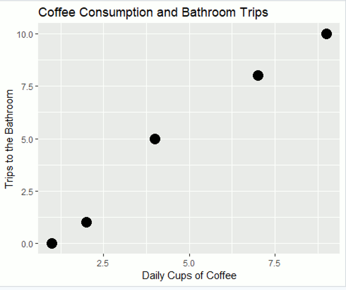
ggplot2 is a very powerful piece of plotting software and the plots look a lot nicer out of the box than R’s base plotting system. You will want to focus your plotting efforts here.
- When your start to learn R, it’s ok to use your spreadsheet software to manipulate data and then plot it in R. Eventually you’ll find more efficient ways to manipulate data in R using packages like dplyr. All in due time though.
- Once you feel comfortable with the above skills, you’ll probably want to start digging into the statistics so you can better interpret and respond to your audience’s questions
- Always think about your audience!
Tips for Teaching and Coaching R
When it comes to teaching and coaching R, there is the academic context and the industrial. I'm going to focus on the industrial. Why? Because this is where I taught myself R and where I had the opportunity to coach and teach several others in my organization. FYI, my organization was composed of physical scientists and engineers. So, my audience was good at math. And, I was always looking for ways to make their life easier. R was there to help and it didn't take long for R to take root in my organization and begin influencing other partnering organizations, as well. Here are some of the things I've learned from my experiences teaching and coaching R:
Make R Useful on Day 1
 Maximize the student's return on time invested by making R immediately useful. Asking someone to learn a programming language to become more productive at work may be good for them but way too much to ask. Remember, we are all busy trying to bring value to our organizations. What is the minimum amount of R needed to bring value and make the life of a would-be user easier? Here, I say:
“Get to the plot.” – Plots are powerful communication devices and immediately useful. As you know, making a moderate or even complex plot in R is generally easy after you've loaded and filtered the data. Think about how much of a nuisance a multi-faceted plot or matrix plot in Excel would be (keeping all the axis, fonts, and colors the same, etc). With ggplot this is simple and takes minutes… Why? Because it's the right tool for the job. Appeal to simplicity and time savings, when you're teaching to motivate the student.
Admittedly, not everyone needs to make a plot. So, think about your audience. Perhaps they have other immediate needs where R would help improve their daily work and happiness. Here are 2 examples:
Other Ways to Make R Useful ASAP
Automated Reports: People waste hours manually moving data from one spreadsheet to another summary level sheet. Sometimes you'll even see folks running monthly numbers over-and-over again by hand in excel. A little training in R markdown could save them and their organizations tones of time and increase employee productivity and happiness.
Pooling Data: Sometimes we need to extract information from several “similarly structured” files and summarize it in one spreadsheet. Manually locating and copying data like this into one spreadsheet can take days depending on the size of the job. It's also very boring and terribly error prone. Think of how quickly a few lines of R could have gotten the job done and eliminated the potential for copy and paste error. Think of an employee's brain melting after several days of doing the same copy-paste operation.
In short, motivate the student's desire to begin learning R by appealing to simplicity, time savings, and the opportunity to learn something new. For example, you might say,
“I’ve seen you spend hours making similar plots and reports every month. The reports look great. But if you’ve got 30 minutes, I can show you how to complete the same task in just a few minutes. As a bonus, you get to learn something new, if you’re interested.”
If they say yes, be prepared to walk them through it. Have them send you some example data and get them to install R and R-Studio on their laptop or desktop before meeting with them. To move them towards independence from the start, show them the essentials and then let them figure out how to apply the simple techniques you've showed them towards completing the job. Keep the meeting simple and on point. If you can fit it into 30 minutes, that's ideal. Getting deep into stats and data processing will scare them off or they may just stop listening. You didn't learn all the ins and outs of R in a day and they won't either.
Student Hands On, Teacher Facilitates
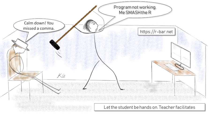
Again, keep the meeting simple. Show them how to be successful, and make sure they have the essentials before they leave your office or session. It's very important that they have the hands-on experience. If you do it for them, they've learned nothing, and will walk away confused. When they seem like they have it, shew them away to work on perfecting the little bit you've taught them on their own.
Give the Student Space
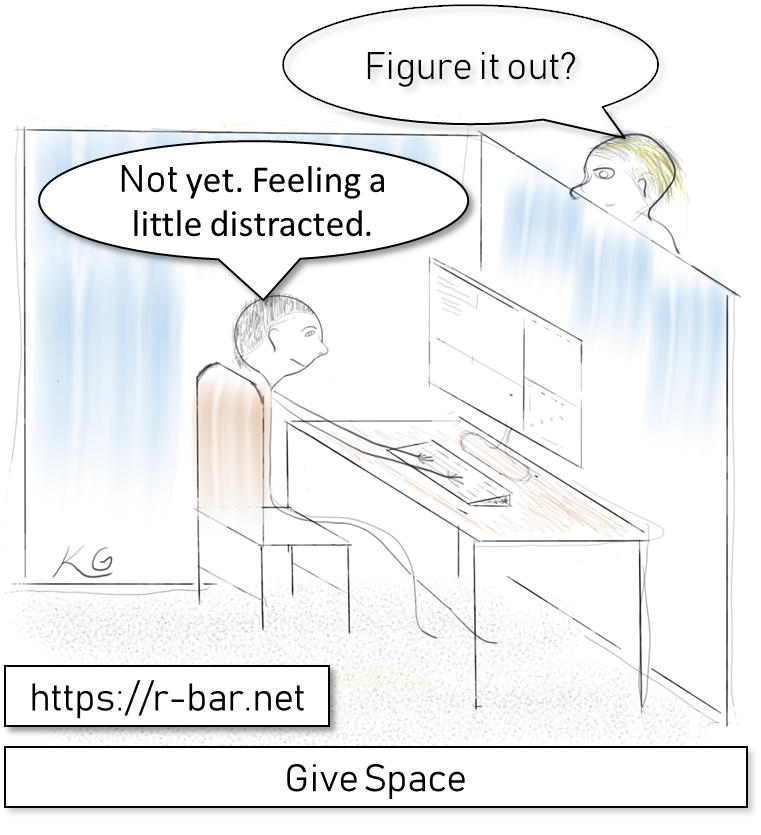
When they leave your office, be patient and don't hover over their shoulder or near their office space seeing if they are doing ok. They will either use what you've taught them or they won't. Either way, give them time. It is very likely they will come back to you soon and say something like, “I got this far, but couldn't figure this step or that step out on my own.” When this happens, you as the teacher have the opportunity to add a little bit of detail and nuance. Again, keep it simple and on point. If you haven't heard from them in few business days, check in. Politely see if they've were able to make any progress and if they need any more assistance. If they say, “no” or “maybe later”. Say “ok” and drop the subject. R isn't for everyone, and others will get there in their own time. Give them space.
Vision: Inspire to Think
 If you're the senior R practitioner in your organization bestowing your knowledge on the crew, here is one last thing to think about. Metaphorically the plot gives us vision, a window into our processes and fundamental business actives. The plot also gives us a communication device to share our findings. But you and I know that R can do more than make a pretty plot. It is a tool that facilitates our thinking about processes and business activities on a deeper level. In this regard over the years, I've come to depend on R to help me simulate and think about more complex problems that moved my organization forward. So, while the plot is immediately impactful and motivational, I believe our true mission as teachers is to give our students the tools to help them think.
Summary
If you're a student beginning to learn R or a practitioner who tries to teach it, don't get hung up on the details in the beginning. Just get to the plot. The details around data wrangling and statistics will come as plotting needs and capabilities increase. For R practitioners, remember we didn't learn R in a day; force your students to be hands on while you facilitate… silently if possible; give your students space to learn and make mistakes; and lastly, as they grow in skill, challenge them to use R to help them think in more complex ways.
Other Articles at r-bar.net
Super Dark Mode Theme for R-Studio
Running Remote R Scripts with Mobile Devices using E-mail Triggers
WooCommerce Image Gallery | Step by Step, Automate with R
XmR Chart | Step-by-Step Guide by Hand and with R
Windows Clipboard Access with R

