 The ggQC package is a quality control extension for ggplot. Use it to create XmR, XbarR, C and many other highly customizable Control Charts. Additional statistical process control functions include Shewart violation checks as well as capability analysis. If your process is running smoothly, visualize the potential impacted of your next process improvement with a Pareto chart. To learn more, read on!
To get started with ggQC, install it from CRAN by running the following code:
1 | install.packages("ggQC") |
ggQC Control Charts
Control charts are a great way to monitor process outputs, drive improvement, and evaluate measurement systems. The types of control chart types supported by ggQC include:
- Individuals Charts : mR, XmR
- Attribute Charts : c, np, p, u
- Studentized Charts: xBar.rBar, xBar.rMedian, xBar.sBar, xMedian.rBar, xMedian.rMedian
- Dispersion Charts: rBar, rMedian, sBar
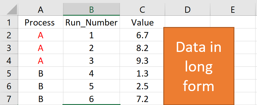
The process for building control charts with ggQC is simple. First, load the ggQC and ggplot2 libraries. Next, load your data into R. Your data should be in long-form. The data set below provides an example of long form data if you're not familiar with the term.
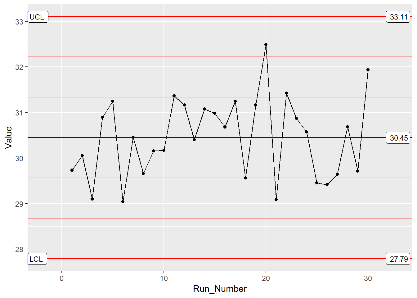
Finally, make your control chart using standard ggplot layer-by-layer syntax and the stat_QC() command. The example code below, shows how all these steps come together to make an XmR plot.
1 2 3 4 5 6 7 8 9 10 11 12 13 14 15 16 17 18 19 20 21 22 23 24 25 26 | ### Load the Needed Libraries library(ggplot2) library(ggQC) ### Make up some demo data (load your file here instead) set.seed(5555) Process_Data <- data.frame( Process=rep(c("A"), each = 30), #Process A Run_Number=c(1:30), #Run Order Value = c(rnorm(n = 30, mean = 30.5, sd = 1)) #Process A Random Data ) ### Make the plot XmR_Plot <- ggplot(Process_Data, aes(x = Run_Number, y = Value)) + #init ggplot geom_point() + geom_line() + # add the points and lines stat_QC(method = "XmR", # specify QC charting method auto.label = T, # Use Autolabels label.digits = 2, # Use two digit in the label show.1n2.sigma = T # Show 1 and two sigma lines ) + scale_x_continuous(expand = expand_scale(mult = .15)) # Pad the x-axis ### Draw the plot - Done XmR_Plot |
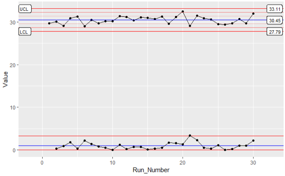
By building upon the ggplot framework, you get a high level of control over the plot details such as points and lines etc. In addition, if you want to put XmR and mR data on the same plot, you can. Just make multiple calls to the stat_QC() command, as shown below.
1 2 3 4 5 6 7 8 9 10 11 12 13 14 | ### Two stat_QC calls XmR_Plot <- ggplot(Process_Data, aes(x = Run_Number, y = Value)) + #init ggplot geom_point() + geom_line() + #add the points and lines stat_QC(method = "XmR", #specify QC charting method auto.label = T, # Use Autolabels label.digits = 2, #Use two digit in the label show.1n2.sigma = T #Show 1 and two sigma lines ) + stat_QC(method="mR") + scale_x_continuous(expand = expand_scale(mult = .15)) # Pad the x-axis ### Draw the plot - Done XmR_Plot |
For more control chart examples, checkout the docs, HOWTOs, and Vignettes at rcontrolcharts.com.
Violation Analysis
To check for out of control data in your process, use the stat_qc_violations() command. When you run this command, your data is checked against the following 4 Shewart violation rules:
- Same Side: 8 or more consecutive, same-side points
- 1 Sigma: 4 or more consecutive, same-side points exceeding 1 sigma
- 2 Sigma: 2 or more consecutive, same-side points exceeding 2 sigma
- 3 Sigma: any points exceeding 3 sigma
This next bit of code demonstrates a violation analysis with the stat_qc_violation() command using process data from the previous section.
1 2 3 4 5 6 7 8 | #Uses the same data as previous example. QC_Violations <- ggplot(Process_Data, aes(x = Run_Number, y = Value)) + #init ggplot stat_qc_violations(method = "XmR" #show.facets = 4 #if you just want facet 4 ) QC_Violations |
After executing the code, you should see a plot with 4 facets – one for each Shewart rule. If you only want to see the 4th facet, set show.facets = 4. Other settings such as show.facets = c(2, 4) will show 1 and 3 sigma violations, only.
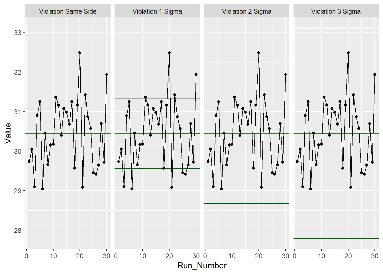
For our test data, none of the standard 4 Shewart violations were observed. Awesome! Next, we’ll look at doing a capability analysis with ggQC.
Capability Analysis
In the previous sections, you learned how to make a control chart with ggQC and check for violations. Here you'll learn how to do a basic capability analysis (Cp, Cpk, Pp, Ppk etc.). For this, we assume the customer has a lower specification limit (LSL) and upper specification limit (USL) of 25 and 37, respectively. With these specifications and the stat_QC_Capability() command, you can do a graphical capability analysis in just a few simple lines of code:
1 2 3 4 5 6 7 8 9 10 11 12 13 | # Uses the same data as the first example CapabilityAnaylsis <- ggplot(Process_Data, aes(x = Value)) + #init ggplot geom_histogram(binwidth = .75, color="purple") + #make the histogram stat_QC_Capability( LSL=25, USL=37, #Specify LSL and USL show.cap.summary = c("Cp", "Cpk"), #selected summary digits = 2, #report two digits method="XmR") + #Use the XmR method scale_x_continuous(expand = expand_scale(mult = c(0.15,.65))) #pad the X-axis #plot the graph CapabilityAnaylsis |
To adjust the capability metrics displayed on the plot, provide the show.cap.summary argument with a vector of desired metrics. Metrics available include:
- TOL: Tolerance in Sigma Units (USL-LSL)/sigma
- DNS: Distance to Nearest Specification Limit in Sigma Units
- Cp: Cp (Within sample elbow-room metric)
- Cpk: Cpk (Within sample centering metric)
- Pp: Pp (Between sample elbow-room metric)
- Ppk: Ppk (Between sample centering metric)
- LCL: Lower Control Limit
- X: Process Center
- UCL: Upper Control Limit
- Sig: Sigma from control charts
The order given in the vector is the order displayed on the chart. In this case, only Cp and Cpk were selected, as shown below.
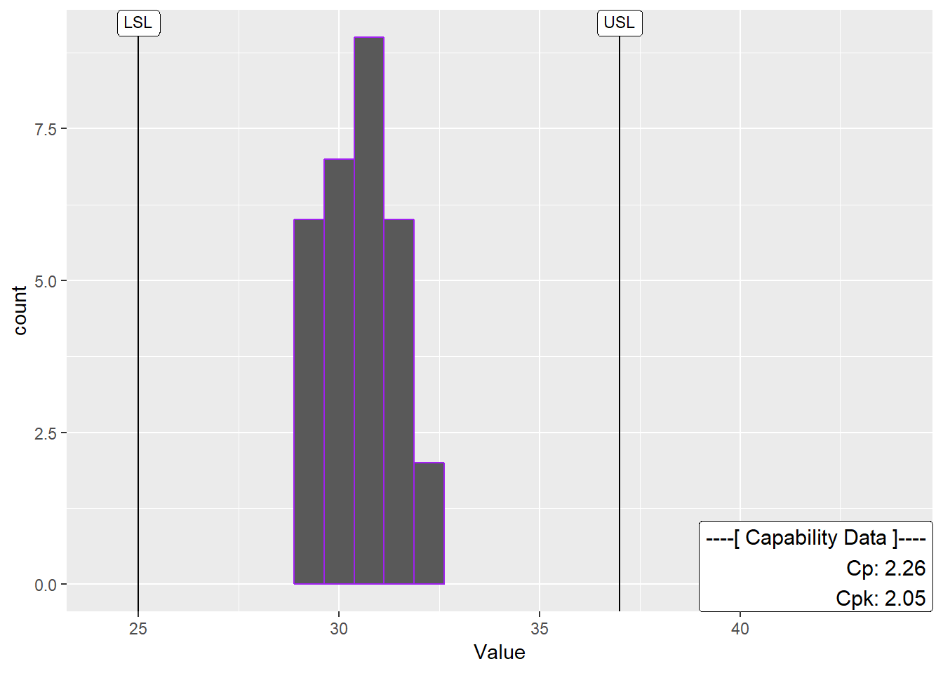
Cool! Looks like the process is in good shape. To see more examples of capability analysis, checkout the ggQC documentation and examples on stat_QC_Capability. stat_QC_Capability is also compatible with ggplot faceting. Note that XbarR capability charts are specified slightly different than XmR.
Pareto Analysis
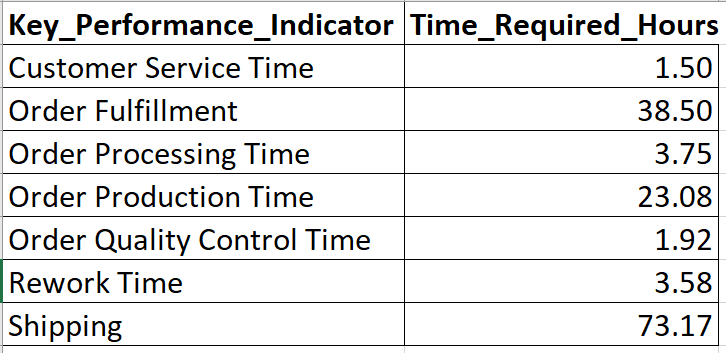
Alright, so your processes are in control. However, you know your process has bottlenecks. Where should you start? One way to help plan your attack is with a Pareto analysis. Suppose you have the following data showing how long several typical process steps take.
To generate a Pareto chart, load the data, initialize ggplot, and let the stat_pareto() command do the rest.
1 2 3 4 5 6 7 8 9 10 11 12 13 14 15 16 17 18 19 | #load your data Data4Pareto <- data.frame( KPI = c("Customer Service Time", "Order Fulfillment", "Order Processing Time", "Order Production Time", "Order Quality Control Time", "Rework Time", "Shipping"), Time = c(1.50, 38.50, 3.75, 23.08, 1.92, 3.58, 73.17) ) #make the plot ggplot(Data4Pareto, aes(x=KPI, y=Time)) + stat_pareto(point.color = "red", point.size = 3, line.color = "black", bars.fill = c("blue", "orange") ) + theme(axis.text.x = element_text(angle = 90, hjust = 1, vjust=0.5)) #done |
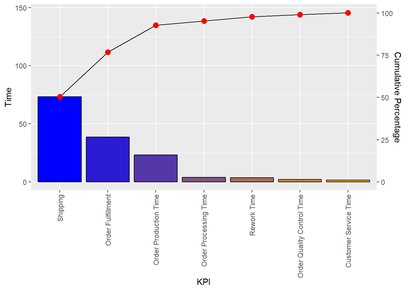
Looks like our next improvement project will focus on either shipping or order fulfillment. Good Luck!
Summary
Building control charts with ggQC is quick and easy, especially if you're already familiar with ggplot. Like other ggplot graphs, ggQC control charts support faceting and are built up layer-by-layer. If you need to make a complicated chart, go ahead. You can add as many stat_QC calls as you like (see XbarR_Vignette). In addition to control charting, ggQC allows you to run Pareto, capability, and Shewart violation analysis. To learn more, please visit rcontrolcharts.com

6 Comments
Majeed Oladokun
This is awesome. I wish to know the possibility of including Taguchi capability (Cpm) metric in the ggQC analysis. Cpm measures on-target performance of a process. I will be glad to read from you. Thanks
Kenith Grey
Good suggestion. I’ll see about making Cpm part of the next release. Thanks for supporting the package.
Pingback:
Brian_C
This is great! If you want to set the LCL and UCL directly (let’s say based on the first 20 to 25 data points), how would you do that?
Kenith Grey
Brian, good question. Here is an extreme example of how to overlay limits determined during process setup on newly collected data with ggQC. The code below has 3 parts: Make up some example data, bind the data together, and plot the data (2 options given).
Option 1: Only calculates the limits for rows having “Setup” in the DataType column. These limits are then applied over the graph
Option 2: Calculates the limits for the first facet, then the user hard codes the limits for additional facets. Again I don’t like this option because if something changes you have to go back and update manually.
Pingback: