Preparing an XmR plot is common when dealing with processes where a single product/item is made or measured and there is a significant time gap between the next production or observation. XmR plots can also be useful when dealing with outputs from a batch process rather than a continuous one.
In this post, we will show how to make quick QC XmR plots with the ggQC package available on cran or github.
cran: install.package("ggQC")
To get us started, let’s simulate some data on the diameter of a golden egg produced monthly by a golden goose.
set.seed(5555)
Golden_Egg_df <- data.frame(month=1:12,
                 egg_diameter = rnorm(n = 12, mean = 1.5, sd = 0.2)
                 )
For fun, lets make the egg on the third month intentionally larger than “normal”.
Golden_Egg_df$egg_diameter[3] <- 2.5
Simple XmR Plot
Great! Let’s make the plot:
Using ggQC, plots are made in the standard ggplot way, except we use a new stat function stat_QC().
library(ggplot2)
library(ggQC)

XmR_Plot <- ggplot(Golden_Egg_df, aes(x = month, y = egg_diameter)) +
               geom_point() + geom_line() +
               stat_QC(method = "XmR")

XmR_Plot
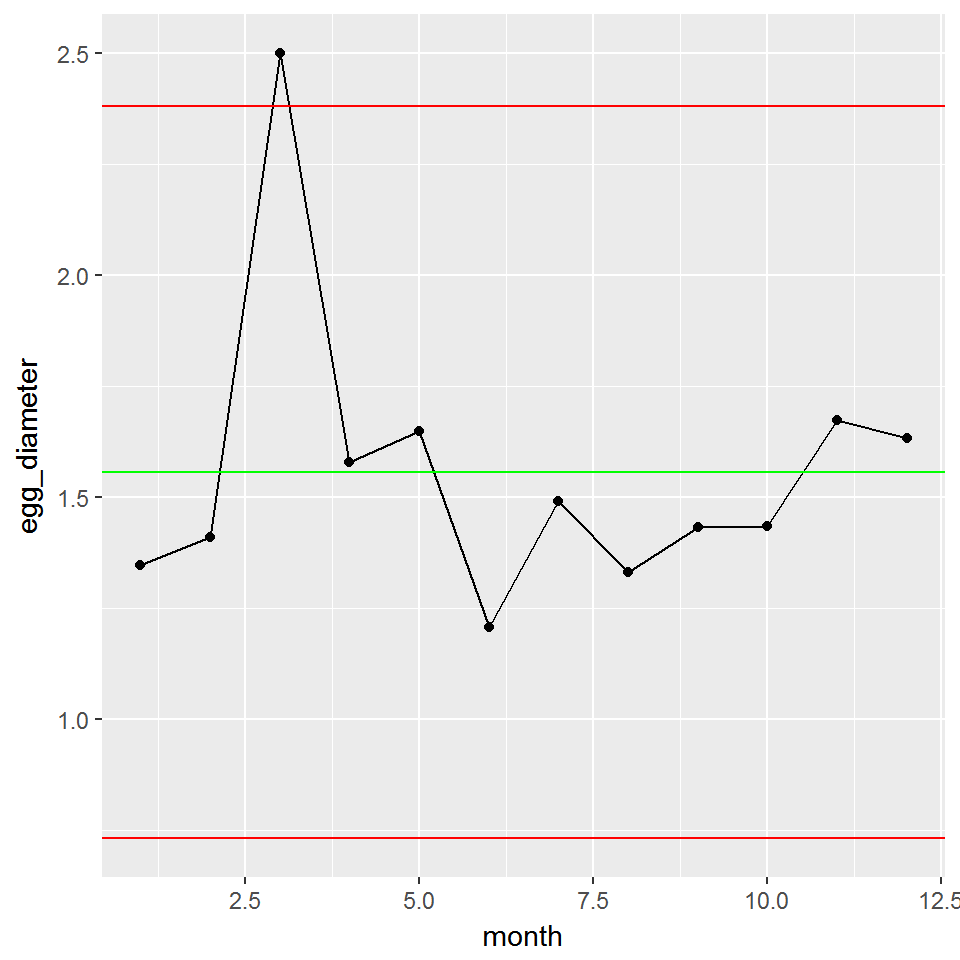
As expected, the 3rd egg is not typical for our golden goose, falling slightly outside the upper control limit. Wouldn’t it be nice if it produced more large eggs like this. Perhaps we should go back and see if the feed was different during the month.
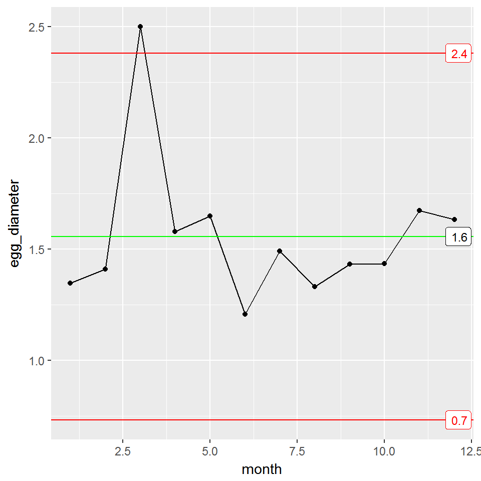
You take the control chart to your boss. He too asks about the feed stock during the third month, but he also wants to know what the control limits are on the plot. To display the control limits, you use the stat_QC_labels function as shown below.
Labeled XmR Plot
XmR_Plot + stat_QC_labels(method="XmR")
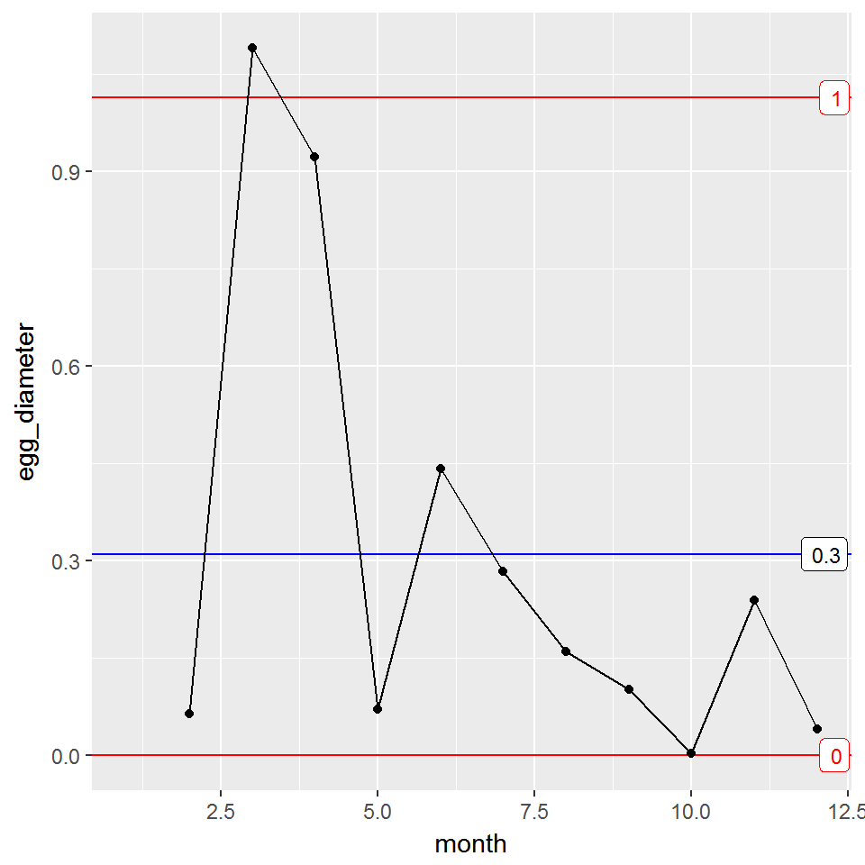
mR Plot
You return back to your boss. He is pleased with the plot, but now wishes to see a plot illustrating egg-to-egg consistency. For this, you will need a Moving Range (mR) plot. Using ggQC, we will call the stat_mR function to render the necessary data.
**Note** it is normal for stat_mR() to produce a warning, because the first point becomes an NA.
mR_Plot <- ggplot(Golden_Egg_df, aes(x = month, y = egg_diameter)) +
               stat_mR() +
               stat_QC_labels(method="mR")

mR_Plot
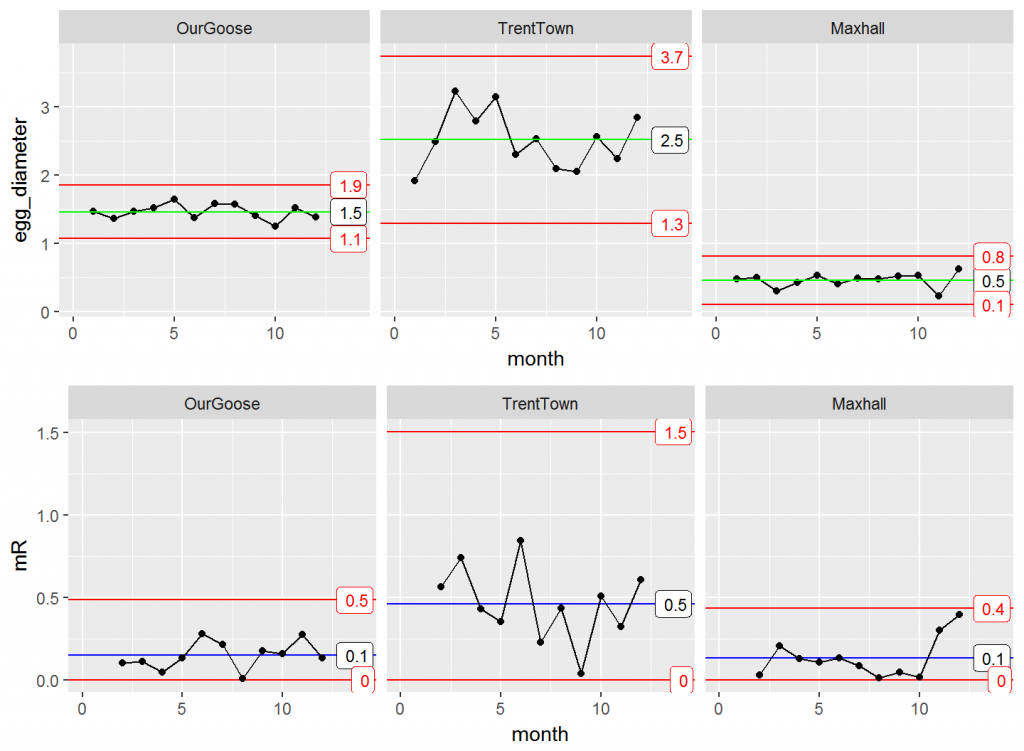
Faceting
The farmer is pleased. The consistency looks good with the exception of the third month. Moving on, he mentions that there is a town fair coming up and there will be eggs there produced by geese from two other towns (Trentown and Maxhall). He gives you last year’s monthly data for each goose and wishes to compare how his own goose’s performed using control charts.
Below, we put the data provided in data frames and bind them together into one data frame. (data is simulated)
set.seed(6666)
OurGoose <- data.frame(month=1:12,
                 egg_diameter = rnorm(n = 12, mean = 1.5, sd = 0.2),
                 group = "OurGoose"
                 )
TrentTown <- data.frame(month=1:12,
                 egg_diameter = rnorm(n = 12, mean = 2.5, sd = 0.6),
                 group = "TrentTown"
                 )

Maxhall <- data.frame(month=1:12,
                 egg_diameter = rnorm(n = 12, mean = .5, sd = 0.1),
                 group = "Maxhall"
                 )

GooseData <- rbind(OurGoose, TrentTown, Maxhall)
Knowing the farmer will want to look at the diameter of the eggs and the consistency of production, you anticipate his request with the following faceted plot.
library(gridExtra)

XmR_Town <- ggplot(GooseData, aes(x = month, y = egg_diameter)) +
               geom_point() + geom_line() +
               stat_QC(method = "XmR") +
               stat_QC_labels(method="XmR") +
               facet_grid(.~group) + xlim(0,14)
mR_Town <- ggplot(GooseData, aes(x = month, y = egg_diameter)) +
               stat_mR(method = "mR") +
               stat_QC_labels(method="mR") +
               facet_grid(.~group) + ylab("mR") + xlim(0,14)


grid.arrange(XmR_Town,  mR_Town, nrow = 2)
Summarizing Result in a Table
Farmer is again pleased, and makes a final request that you summarize the mean and control limits for each goose in a table that he can print and put in his wallet for the fair.
This can be done quickly using ddply and the QC_Lines function.
library(plyr)

ddply(GooseData, .variables = "group",
      .fun = function(df)
        {QC_Lines(data = df$egg_diameter, method = "XmR")}
      )
| group | xBar_one_LCL | mean | xBar_one_UCL | mR_LCL | mR | mR_UCL |
|---|---|---|---|---|---|---|
| OurGoose | 1.067510 | 1.4617341 | 1.8559579 | 0 | 0.1482044 | 0.4843321 |
| TrentTown | 1.291068 | 2.5171125 | 3.7431568 | 0 | 0.4609189 | 1.5062830 |
| Maxhall | 0.104316 | 0.4570895 | 0.8098629 | 0 | 0.1326216 | 0.4334074 |
To learn more about ggQC or see more examples, visit rcontrolcharts.com

One Comment
Pingback: